
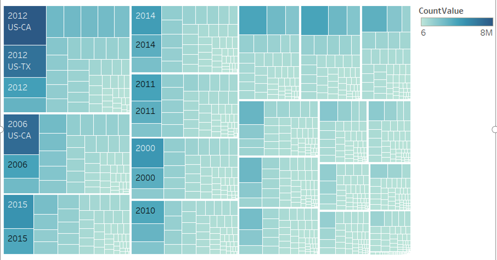
• Name of Tool: Tableau Public
• Country: U.S.
• Disease: Chlamydia
• Year: 2006-2016
• Visual Mappings:
-
size: The color is mapped to the size of the count value, namely the number of people sick.
-
shape: Each small rectangle is mapped to a certain year, and a large rectangle maps the number of years.
-
size: The size shows the sum CountValue.
• Unique Observation: we can see that number of patients in 2012,2006,2015,2014,2011,2010,2000, which the figure occupied the largest proportion in 2010. Besides, we can hardly see other reports about chlamydia.
• Data Preparation: We need to know the annual data of each state, the color depth refers to the number of patients.
Source : Data from Project Tycho (https://www.tycho.pitt.edu/)
DOI: 10.25337/ptycho.v2.0/US.105629000
Question : Is my diagram reasonably showing visual Chlamydia in the US?