
I’m a student from Swansea University looking to visualise some data from the Tycho project - namely that on the Dengue virus across all countries for which there is data. Visualisation made using Tableau.
Countries: Brazil, Vietnam, China, Thailand, Cuba, India, etc.
Disease: Dengue virus
Years: 1955-2009
X-axis is mapped to average number of recorded Dengue cases for each country across all years, y-axis mapped to median across all years. Each different colour represents a different country - in retrospect, this is fairly redundant, only serving to make multiple clustered points more distinguishable from each other.
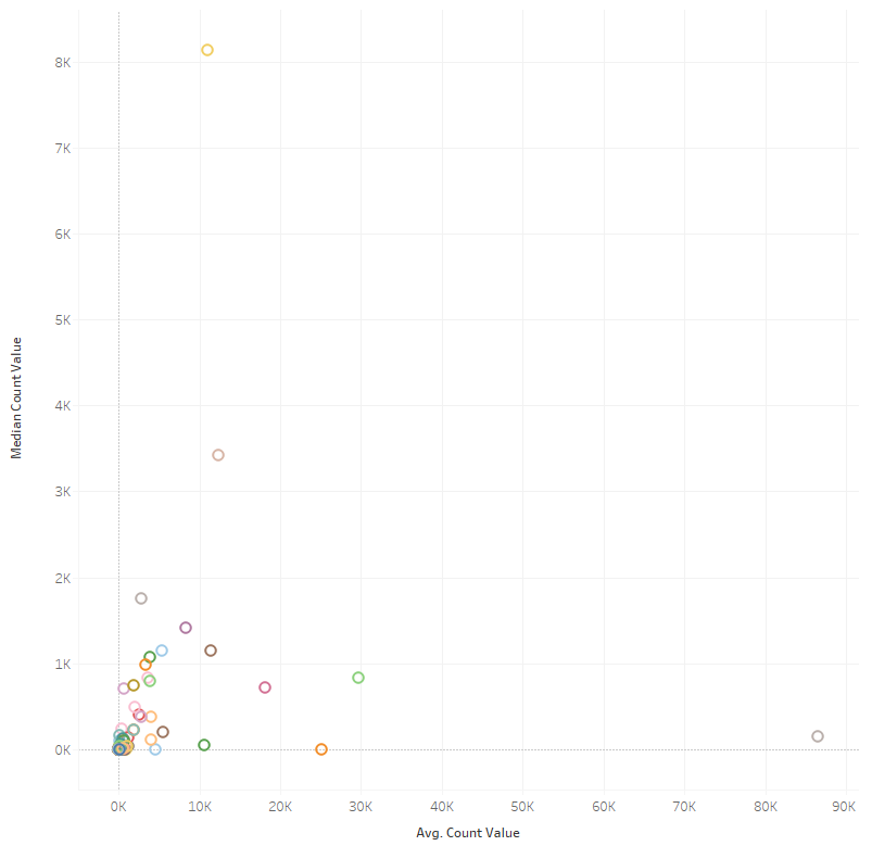
My intention was to easily identify countries where the mean value, which is easily skewed by outliers, and the median value were either very close or very disparate - the former implying Dengue cases to remain relatively stable, the latter implying a tendency toward sudden outbreaks.
My questions are as follows:
Should I have opted for utilising logarithmic scales on the axes in order to make the differences between tightly-clustered datapoints more visible, or would the nature of such impede at-a-glance understanding of the data?
Moreover, would another form of visualisation be better suited to showing the relationship between average number of Dengue cases and the median?