
Hi,
I am a Swansea University Student and I’ve been asked to examine the project tycho data(www.tycho.pitt.edu). The treemap i made is down below.
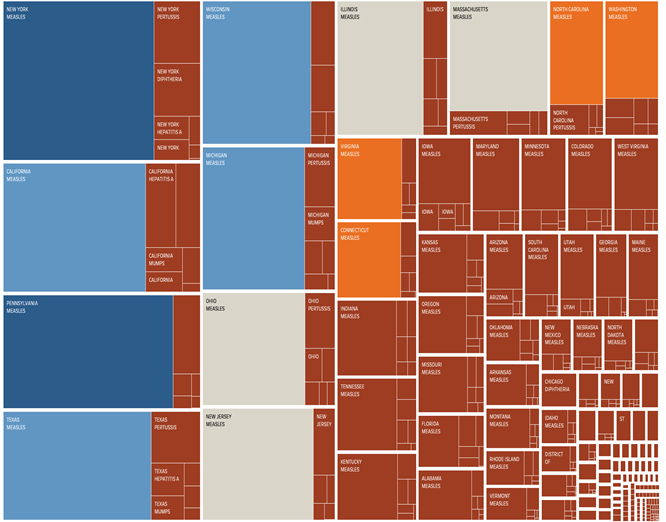
Tool: Tableau
Country: USA
Source: https://www.tycho.pitt.edu/data/
Disease: Measles, Pertussis, Diphtheria, Hepatitis A ,Polio, Rubella, Smallpox, Mumps
Visual mappings:
- Colour : Each colour determines different values of cases of diseases found in each state.
- Group by : States -> Name of diseases
-
Size: Number of people affected
Question: Is my treemap clear or is there any other way I can do to improve this so others are able to understand the data?
Thanks.