Hi
I am a Swansea University student (probably one of may on here).
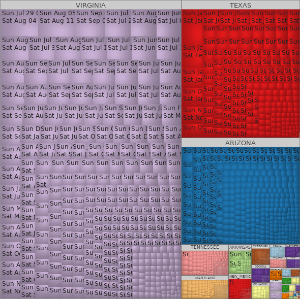
I have been asked to examine the project tycho data from https://www.tycho.pitt.edu/ and have produced a treemap for this data
Tool: Macrofocus TreeMap (treemap.com)
Country: USA
DOI: 10.25337/T7/ptycho.v2.0/US.111939009
Disease: Dysentery
Visual mappings:
-
Colour : Admin1Name - (State)
-
Group by : Admin1Name
-
Size: CountValue - (How many were infected)
-
Data preparation:
-
I have removed all columns that were N/A i.e. the city and columns that contained the same value for every row i.e. all records had “United States” as the country and there were 0 fatalities from Dysentery.
The labels on the blocks indicate the start and end date of each of the records.
Does My design make sense?
Is there anything I could change to make it easier to understand?
Thank you in advance
Dan