
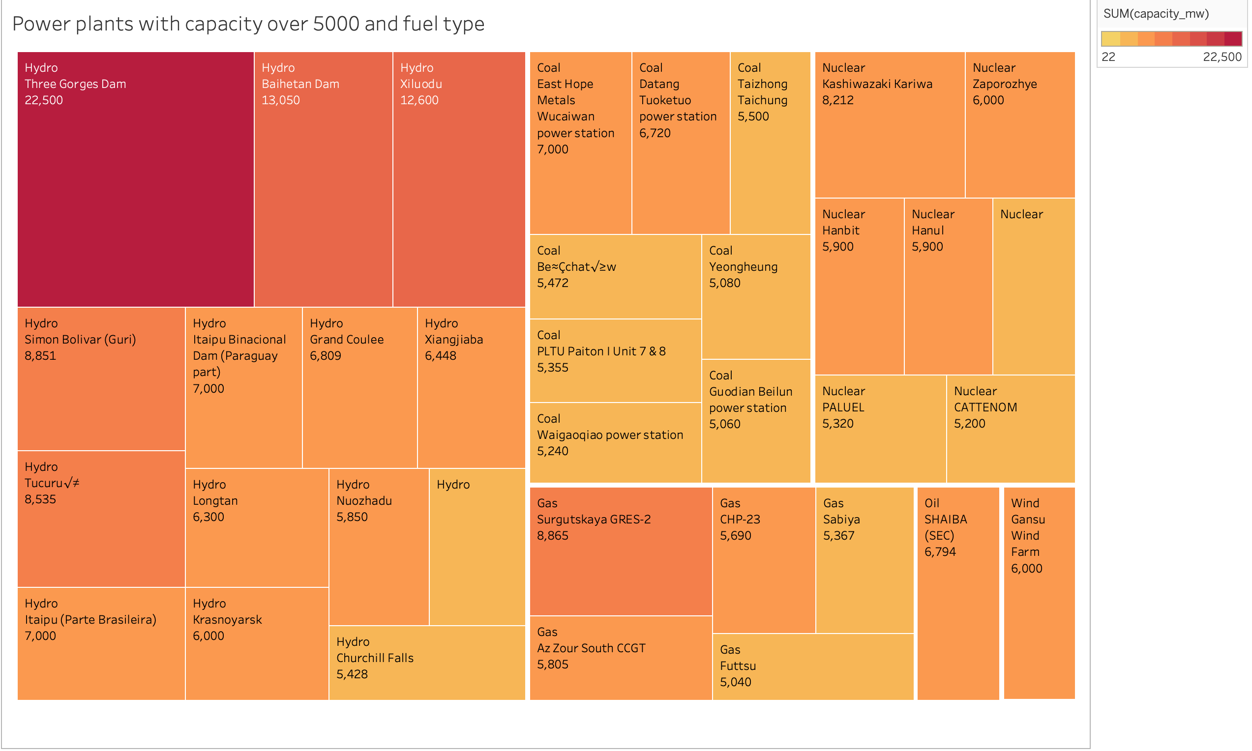
Design Type: Tree map
Name of Tool: Tableau
Country: NA
Year: NA
Visual Mappings: Colour maps to the sum of the capacity for each power plants. Size maps to the sum of the capacity for each power plants
**Unique Observation: You can see that Hydro is has the highest capacity in among all the power plants and Three Gorges Dam produces it. You can see that hydro takes more production capacity. **
Data preparation: Because it’s a large data I had to filter power plants that use over 5000 in capacity. I added the capacity of each power plant so it will be easy to understand.
Hi guys, I have done a Treemap showing power plants that use the most capacity from this dataset (http://datasets.wri.org/dataset/globalpowerplantdatabase).
I have some questions:
- Is it easy to understand this visualization?
- What can I do to make it better
Thank you.