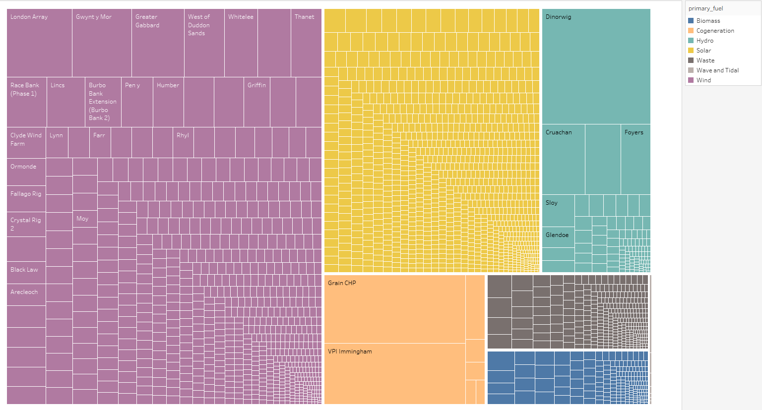
This is a tree map displaying the capacity of each renewable energy power plant within the UK, where the size of each leaf node is representative of their capacity. The bigger it is the greater the capacity. They are sorted by colour based on their fuel types.
To create this visualisation I used the ‘global_power_plant _database’ dataset.
To assist me in the creation of this visualisation I used the ‘Tree visualization with treemaps: 2D Space Filling Approach’ paper.
I would appreciate it if you could answer some questions about my visualisation.
- How would you improve the design of this visualisation.