
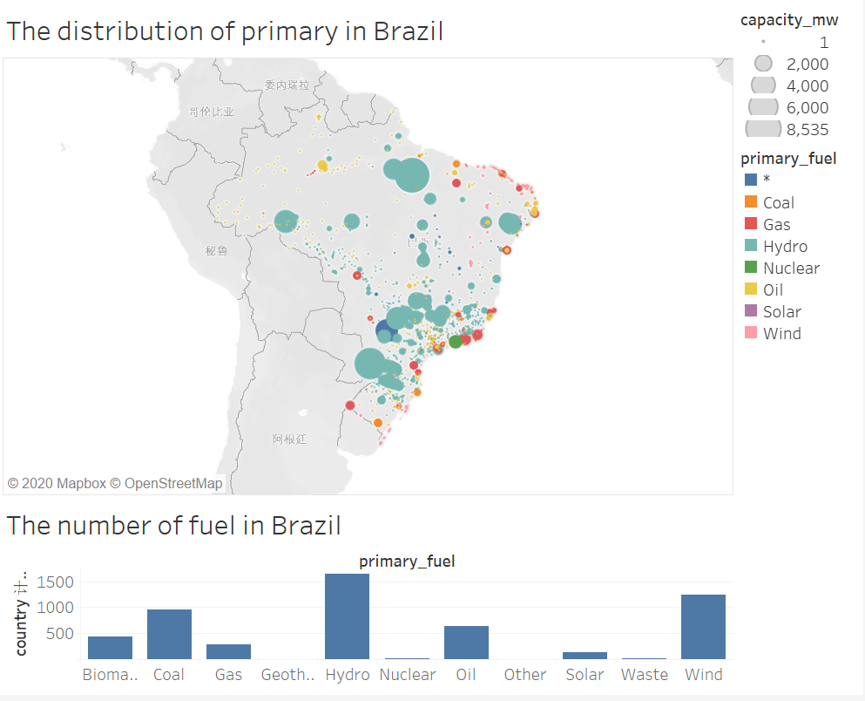
Visual Design Type: The distribution of primary from Brazil
Name of Tool: Tableau
Country: Brazil
Year: All of the years in the dataset
Visual Mappings: This visual structure comprises of a guide and a histogram. The guide takes the longitude and scope of Brazil as the X arrange and Y facilitate of the organize pivot. Diverse spot hues speak to various kinds of intensity age vitality. There are nine vitality types taking all things together, so there are nine distinct hues. The particular facilitate position of each point speaks to the arrange position of the force station in Brazil. The size of the circle speaks to the force age limit of the force station. The bigger the circle, the more force age limit. In the subsequent histogram, the x-hub speaks to various vitality types, and the y-hub speaks to the quantity of vitality stations in Brazil.
Unique Observation: Brazil relies most on hydropower, followed by wind power and finally coal power. These three types are the main power generation types in Brazil. In Brazil, there are a lot of inland water power plants, which may be because there are many rivers in Brazil that can be used to generate electricity. And the power generation capacity is relatively high. In the coastal part of Brazil, there are various types of power generation. In general, Brazil is still relatively dependent on hydropower.
Data Preparation: In all the information, extricate all the information that the nation name is Brazil. Also, put the information to be imagined into the comparing list.
Questions:
• Does my visual design make sense?
• Are there any other types of visual layouts that would be better for this
challenge?
• How else could I visualize the relationships between countries?