
Source: http://datasets.wri.org/dataset/globalpowerplantdatabase
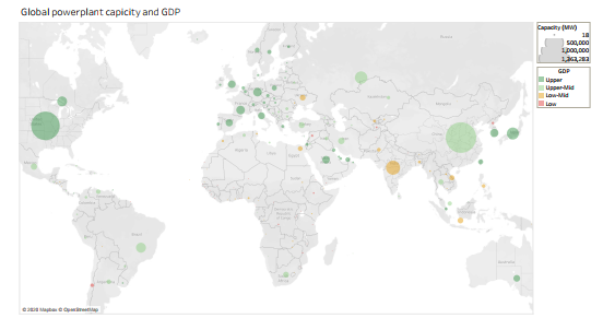
Visual design type: Map
Name of tool: Tableau
Country : World Map excluding Antarctica
Year: NA
Visual mappings:
- X/Y = Longitude/Latitude
- Point location = Average country latitude/longitude
- Point size = sum of capacity in given country
- Point colour = GDP
Question:
I am attempting to plot an overview of the way GDP levels affect national energy capacity. I am wondering if the use of colour for the points is effective, or should Upper middle and Upper be changed to more easily distinguish them?