Hi all,
I am a student from Swansea university enrolled on the Data Visualization module. I have prepared some data on the number of measles cases from the years 1955-1975 using the data provided from Project Tycho (https://www.tycho.pitt.edu/). I then had the intention of capturing the positive impact the measles vaccine had brought when introduced in 1963 in the US. However, I need some help in finding an alternative way of representing time-series data instead of using a streamgraph or heatmap. I have produced a streamgraph with my data and have a couple of questions to ask. This can be seen below:
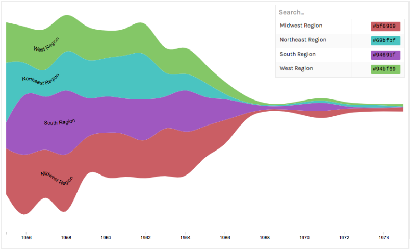
From the streamgraph we can see that the number of cases in all four regions of the United States (excluding territories that are not states) had decreased gradually but substantially after the introduction of the vaccine in 1963. The states were grouped by region to achieve abstraction and present the overlying trend of declining cases. My questions are as follows:
-Using your knowledge and/or experience, does this data look correct? Is there anything from the visualization to suggest something went wrong during the data preparation stage?
-What other visual designs would you recommend apart from the streamgraph used or a heatmap that is commonly used?
I would love to get a response. Thanks for your help.
Visual design type: Streamgraph
Tool: RAWGraphs
Country: United States of America (excluding territories)
Disease: Measles
Year(s): 1955-1975
Visual mappings: The X-axis represents the years from 1955-1975. The Y-axis represents the number of cases. Each region of America is represented as a stream. The height of the stream displays how the number of cases for each region changes overtime. The larger the height, the larger the number of cases. Each stream is coloured to represent a region of the US as can be seen by the colour key on the top right.
Unique Observation: After 1963 or 1964, there was a gradual but quick decrease in the number of measles cases until around 1968 where it remained relatively steady. This is interesting because the measles vaccine was introduced into the US in the year of 1963. After the vaccination, the decrease occurred with it reaching a consistent and low level by 1968. This gives a good visual representing the effectiveness of the vaccine. The impact was also mentioned in the paper Impact of measles on the United States (https://www.ncbi.nlm.nih.gov/pubmed/6878996). We can also see that the midwest region and south region had the largest number of cases from 1955 to 1963.
Data Preparation: Data was extracted for the years of 1955-1975 specifically the non-cumulative data. Territories such as Puerto Rico and Guam which are not states were removed from the dataset. An additional column for region was added to group the states by region. This data was retrieved from the United States Census Bureau (https://www2.census.gov/geo/pdfs/maps-data/maps/reference/us_regdiv.pdf).
Edit(03/03/2019)
I was interested in first visualizing my data using a streamgraph after reading about it in “Data visualization with D3.js Cookbook” but decided I was interested in finding alternatives.
References:
Zhu, N. Q. (2013). Data Visualization with D3.js Cookbook . Journal of Chemical Information and Modeling . https://doi.org/10.1017/CBO9781107415324.004
Edit(03/03/2019)
DOI: 10.25337/T7/ptycho.v2.0/US.14189004