
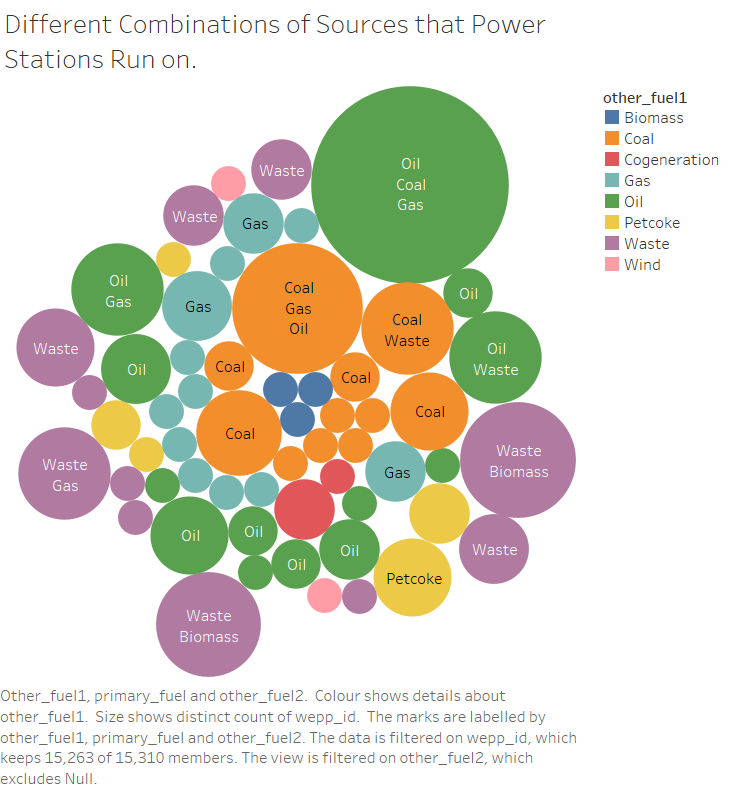
This is a plot to show how common different combinations of fuel sources are.
I would like some help on how this could be made better, or show what I am trying to show more clearly and easily.
I am using data from the http://datasets.wri.org/dataset/globalpowerplantdatabase
In my plot, colour is mapped to the primary fuel source, and size of each node is mapped to the number of power plants using that combination of fuel sources.
Mapping colour to primary maybe doesn’t seem ideal but I can’t think of a better alternative and the visual design is easy to understand after reading the description.