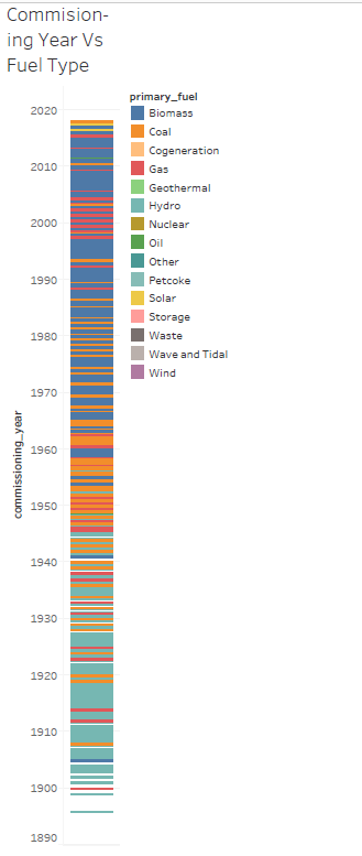
This gantt chart shows how the type of power plants being commissioned changed over the time period of 1896 to 2018. This is not specific to a certain country, it encompasses most countries.
This visualisation was created using the ‘global_power_plant_database’ dataset.
To aid in the creation of this visualisation I used the ’ Many Eyes: A Site for Visualization at Internet Scale’ paper.
I would like your professional opinion on my visualisation:
- Could the colour palette be improved?
2.Would it be more visually appealing if the data points where further away from each other?