
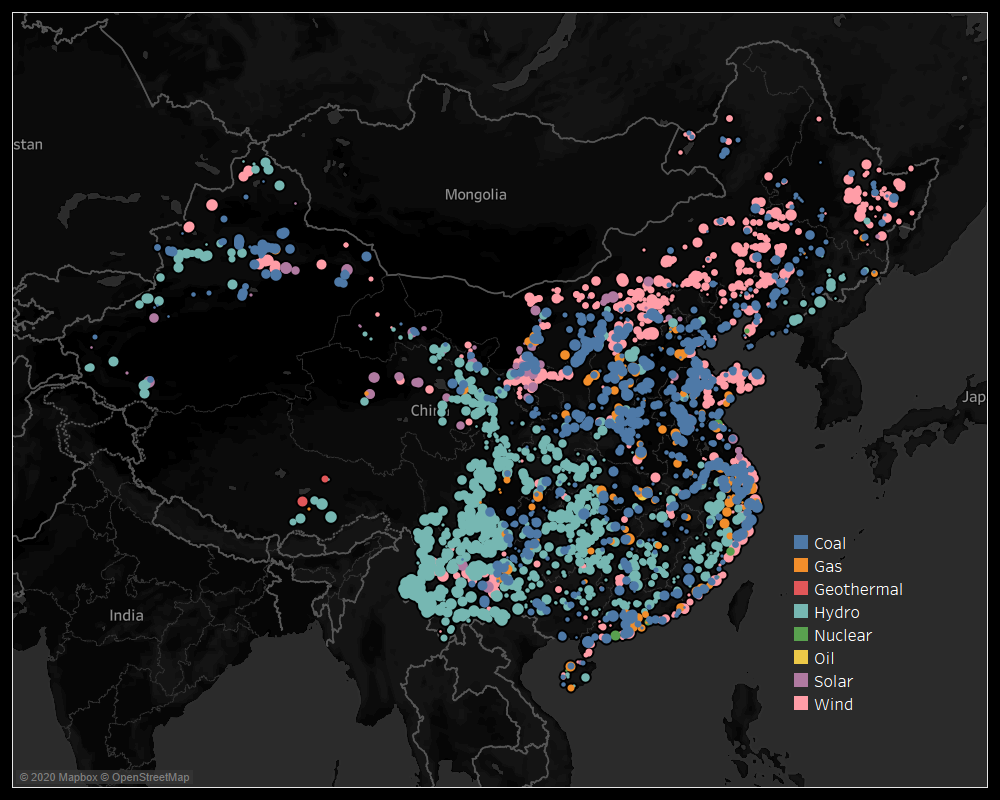
Source: http://datasets.wri.org/dataset/globalpowerplantdatabase
Visual Design Type: Maps
Name of Tool: Tableau
Country: China
Year: 2017
Visual Mappings:
Colour - type of fuel
Position on Map - location of the plant using that fuel type
Unique Observations:
- Which fuel types are most prevalent in China (the biggest market for power plants)
- The regions that best suit each fuel type. The windiest area, the areas where all the dams are
Data Preparation:
- Filter country to just China
- Use long/lat to map the plant’s locations
- Display the fuel type of each plant and uniquely colour each one
Questions:
Does my design display information effectively?
Is my choice of colours best for this type of visualization?
How can this design be improved?