
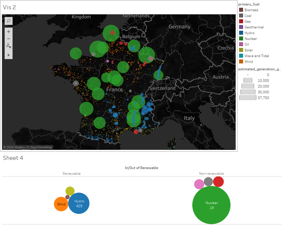
Visual Design Type : Symbol Map
Name of Tool: Tableau
Country: France
Year: 2014
Visual Mappings:
Colour: primary_fuel
Filter: country_long: France
Size: SUM(estimated_generation_gwh)
Detail: name
X Axis: AVG(longitude)
Y Axis: AVG(latitude)
Unique Observation: From this visualisation you can see how much of the country’s power generation comes from nuclear power plants. Another observation is that the majority of the solar generation occurs in the south and most of the wind generation occurs in the north of the country. Lastly, you can see how the main source of power comes from non-renewable power sources.
Data Preparation: The country_long field was filtered to only look at data in ‘France’. Additionally, I created two sets, one for renewable sources of energy and one for non-renewable sources.
Source : http://datasets.wri.org/dataset/globalpowerplantdatabase
Questions: Is it easy to see that most of France’s power generation comes from nuclear energy? Is the colour map chosen useful in identifying the fuel type used?
Thank you.
