
Hi, I am a student at Swansea University student and I study Data Visualisation. A coursework we have received requires us to make some visualizations using data from Project Tycho (https://www.tycho.pitt.edu/). I have a question that relates to the labeling of a Choropleth I have made to visualize the number of cases of Gonorrhea per 100,000 per US state between 2007-2017.
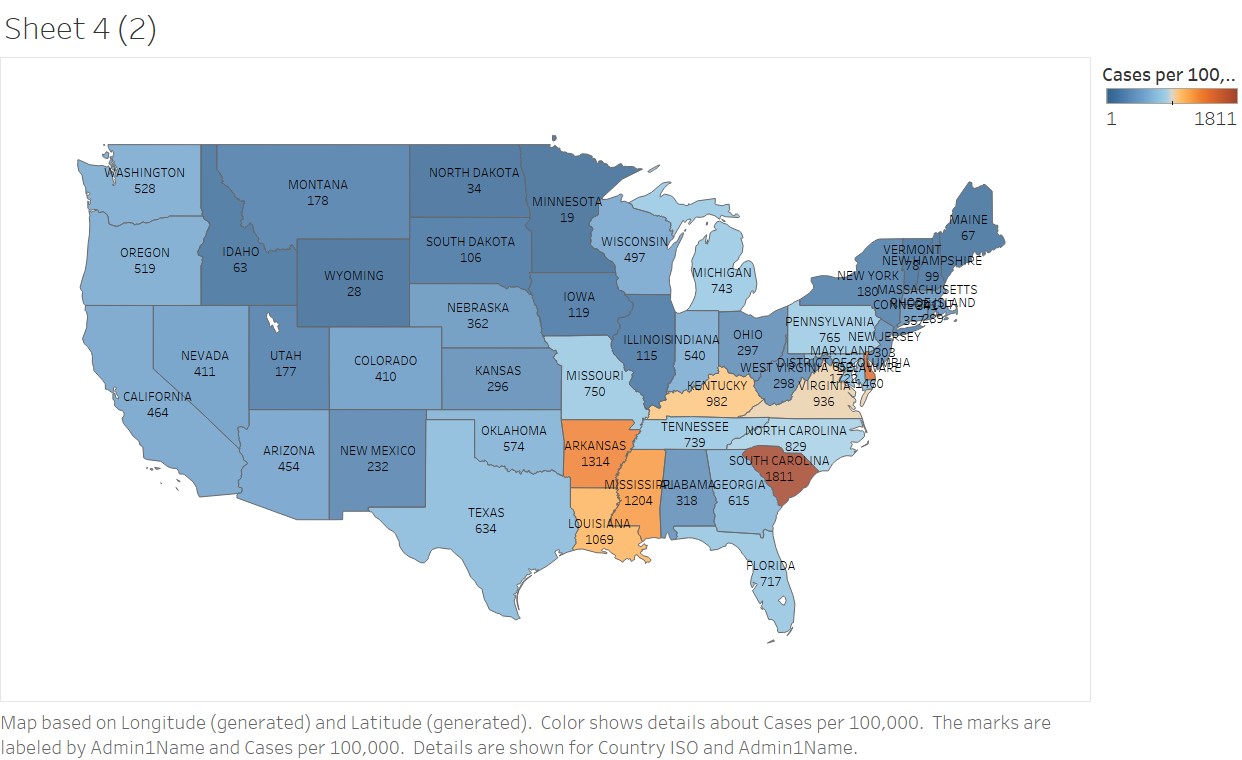
Visual Design Type: Choropleth
Name of Tool: Tableau
Country: US
Disease: Gonorrhea
Year(s): 2007-2017
Visual Mappings:
Colour – The number of cases per 100,000 in each state is mapped to a colour. The colour and intensity represents the number of cases, dark blue shows the least cases and dark gold shows the most.
Position: The data is mapped to states in the US
Unique Observation: Arkansas, Louisiana, Mississipi, South Carolina, Kentucky, Virginia, Delaware and District of Columbia all have a higher number of cases per 100,000 than average (median) because they are all coloured some shade of gold. It can also be learned that South Carolina has the highest number of cases per 100,000 in the country.
Data Preparations: The disease data was compiled using the “Compile Your Own” feature of Project Tycho to filter the full Gonorrhea dataset (**DOI:**10.25337/T7/ptycho.v2.0/US.15628003) down to between the years of 2007-2017. The data was then imported into tableau so the number of cases per state could be summed up thus I could export a more manageable file. I then performed my calculations on the newly exported file in Excel and used population figures from the 2010 census that I found on Wikipedia.
My Question: I would like to show labels for both the number of cases and the state names, the problem is that there are so many labels that they become unreadable as they overlap in areas where the states are smaller, this happens most on the east coast. I have made the labels as small as tableau will let me and I still have the same problem. I also read a blog (https://www.dataquest.io/blog/design-tips-for-data-viz/) that said I should eliminate labels that aren’t necessary for someone to understand my visualization; since the number of cases is already represented by colour I could choose to remove that label from each state, however most of the space is being used by the labels for the state names. I don’t want to remove the labels for state names because I consider them important to people who aren’t very familiar with the states or their locations. Are there any other alternatives I can try to clean up the visualization while keeping the same labels?